Your app may have the most powerful set of features in the marketplace, but if users can’t navigate your product and they quit within seconds, they’ll never come back. Your UI/UX design can be the difference between your product being successful and being silent. This blog explores why UI/UX design is a must have and how WeeTech Solutions can help your business create an experience users truly enjoy.
Why UI/UX Design Can Make or Break Your App
What separates apps that become household names from those that get deleted within 24 hours of downloading?
The answer is rarely the technology underneath. It is almost always the experience on top. UI/UX design governs every single interaction a user has with your product. It shapes their emotions, their trust, their patience, and ultimately their decision to stay or abandon your platform entirely. Understanding exactly where design succeeds and fails gives businesses the clarity they need to invest wisely.
First Impressions Decide User Trust
Image Source Webplanex Medium
You only have 50 milliseconds to establish first impressions. Yes, 50 ms. There is research from Google’s research team that shows users can quickly come up with a visual judgement about a digital product before conscious thought even registers. That judgement will affect whether or not they continue interacting with the app or immediately delete it.
A cluttered layout, a mismatch of font and colours or confusing digital navigation will make a digital product instantly obvious: it hasn’t been built in care. Users won’t consciously analyse every element of the design, they will just “feel” the final outcome. A polished, clean looking interface tells your user that your product is a professional, trustworthy and reliable product!.
Remember, trust is the currency for conversion. When people download financial, medical, or e-commerce products, it is because they trust them; they believe that this product provides something that is worthy of their time and mind. Investing in a well thought-out UI keeps people curious, and lets them stay with confidence. No faults, no fail.
Poor UX Leads to High Drop-Off Rates
Baymard Institute has some shocking data to share on this: The average cart abandonment rate across e-commerce sites is 70.19%. A sizable chunk of these abandonments are due to weak UX. Whether it’s convoluted checkout flows, unclear fields, too many steps, and confusing navigation, they all lead to abandonment at the vital moment when you want them converted.
Don’t just look at checkout as an exit point; people abandon apps during onboarding when the process is unnecessarily complex, they abandon during sign-up when they’re required to fill out too many fields, and unable to search for products they’re unable to find their filter in. The friction element at each step is an exit point, and if your UX is weak, you create friction everywhere.
Fixing the drop-off points you discover having mapped your users’ experience and run usability tests. Easier said than done? No, fine-tuning UX to remove friction won’t require you to roll the product back into the factory. It’s a highly focused, data-driven UX refresh that will break up the friction and give you momentum again down the user flow.
Good Design Improves Engagement and Retention
Image Source IT Pros
Acquiring a new user is much more expensive than keeping them. Bain and Company’s research shows that just a 5% increase in retention leads to an increase in profitability of 25% to 95%. And the most efficient way to do that is by designing an exceptional UX.
Users will keep coming back to an app where things feel easy. If you can make the flow of information or the way you navigate feel natural and fluid, then your users will just start doing it. They will open the app because they have a newly-found sense of ease and reward.
Performance indicators such as session length, daily active users and feature usage all rise noticeably when good UX is in place. And to investors, shareholders or the wider growth team, these are numbers that really matter. This means that investing in great UX design is not just a creative decision but a performance one – one that can be measured.
UI/UX Impacts Conversions and Revenue
The Link Between Design and Revenue Is Stronger Than You Think.
Consider this: while most business owners believe they need investment to get revenue, little organic investment can bring this in hand through its effects on your existing products. UX is the work you do to optimise the design and usability of your product or service. This translates into better engagement and increased revenue. It has an impact on your bottom line.
Forrester Research found that every pound invested in UX returns 100 pounds in return, which imply a whopping 9,900% return on investment. This shows design has a commercial influence beyond brand perception. It influences purchasing psychology more directly.
Conversion rate optimisation
There is a noticeable difference between paid acquisition and the benefits of conversion rate optimisation (CRO). If your product is already working well for users in general, but you haven’t yet seen the full potential, you can change just a few variables to produce a 300% increase in conversion with just a 5% increase in marketing spend. Reducing the number of steps in your checkout flow, making your call to action stand out more, simplifying the design of forms or clarifying how your pricing works are all stimuli that work to increase your conversion rates.
You use colour to shape urgency and affect buying patterns. You use typography to affect readability and comprehension. You use button placement to affect how quickly customers will make a decision. You use whitespace to reduce mental effort. Every visual decision you make supports and enhances your conversion rate. If your user interface design expert (UIDE) has time to think about design to convert, not so much to look pretty.
Strong Design Builds Brand Credibility
Your app is your brand’s most direct ambassador to users. Much of your conversion focus will be based on your app’s design. Compared with a website that users visit occasionally and access on a number of different devices, an app will sit on a customer’s device, with its icon on their home screen. Every time they interact with your app’s interface or they share a screenshot with friends, they’re interacting with your brand image.
Consistent design that looks good and feels good sends a clear signal to your users: You’re serious about them. Bad design signals a lack of investment in people and a lack of investment only in features. Bad design decreases credibility over time. Good design increases it. Users who like your design value your product. Users who like your product value your company and voluntarily recommend it.
A Stanford University Web Credibility Research study found that 75% of people judge your company’s credibility based on your web site and app design alone. For many digital-first businesses, that means rethink design as aesthetics and prioritize it as business infrastructure.
Bad Design Increases Development Rework
During the lifespan of any UI/UX project, one of the biggest unknowable cost drivers is the downstream development expense caused by any design issues. Fixing a problem during the development phase is 10x more costly than fixing it during the design phase, and 100x more costly if found after you release the product, IBM research shows.
Investing in extensive prototyping, wireframing, and usability testing pre-development is not a nice-to-have, timeline item. It is a cost-saver that avoids costly rework cycles. WeeTech Solutions’ product prototyping services help solve this problem by testing and validating concepts and user flows before the first line of production code is written.
Key Principles of Effective UI/UX Design
Image Source freepik
Understanding what separates good design from great design helps set the right standards from the beginning.
Clarity over complexity: Every screen should communicate its purpose instantly without explanation
Consistency: Visual language, terminology, and interaction patterns should remain uniform throughout
Accessibility: Designs must function for users of all abilities across diverse devices and screen sizes
Feedback and responsiveness: Every user action should receive immediate, clear visual confirmation
Hierarchy: Important information and actions must be visually prioritised above secondary elements
Minimal cognitive load: Users should never need to remember information between screens unnecessarily
User-centred validation: Design decisions should be driven by user research and testing data rather than assumption
Performance consideration: Beautiful designs that load slowly fail users just as thoroughly as ugly ones that load fast
Even experienced teams make these critical errors that silently damage app performance and user satisfaction.
Overloading the onboarding process with excessive steps and information requests upfront
Ignoring mobile-first design principles when the majority of users access via smartphone
Using inconsistent button styles, fonts, and colour patterns across different screens
Burying primary calls to action beneath secondary content and navigation elements
Neglecting accessibility requirements including sufficient colour contrast and touch target sizing
Skipping user testing entirely and relying solely on internal team opinions for design validation
Designing for the best-case scenario without accounting for error states and edge cases
Failing to iterate after launch based on real user behaviour data and feedback signals
Creating navigation structures that require more than three taps to reach core functionality
Prioritising visual novelty over functional clarity and intuitive interaction patterns
How WeeTech Helps You Build High-Performing User Experiences
WeeTech Solutions approaches UI/UX design as a strategic business function rather than a visual exercise.
The process begins with understanding. WeeTech’s team conducts thorough user research, competitive analysis, and stakeholder workshops to build a precise picture of who your users are and what they genuinely need from your product. This foundation ensures every design decision serves a validated purpose.
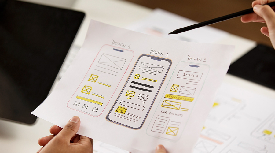
From this research, WeeTech develops detailed wireframes and interactive prototypes that allow stakeholders to experience and test the product concept before any development investment is made. This prototyping phase reduces risk dramatically by surfacing usability issues when they are cheapest and fastest to resolve.
The UI design phase translates validated wireframes into visually compelling, brand-aligned interfaces. WeeTech’s designers apply proven principles of visual hierarchy, colour psychology, and typographic clarity to create screens that communicate immediately and engage consistently across every device and resolution.
User journey mapping and usability testing sessions with real users provide objective performance data for each design iteration. WeeTech analyses where users hesitate, where they succeed, and where they abandon, then refines accordingly. This evidence-based iteration cycle produces products that improve continuously rather than stagnating post-launch.
For businesses that already have live products, WeeTech’s UX evaluation service identifies existing friction points and prioritises improvements by their potential impact on engagement, retention, and conversion. This targeted approach delivers measurable results without requiring complete product rebuilds.
With over 1,600 transformation experts and a track record across diverse industries, WeeTech Solutions brings both creative excellence and technical rigour to every UI/UX engagement.
Conclusion
UI/UX design is not decoration. It is the mechanism through which your product either earns user trust or loses it permanently. Every interaction, every screen, and every design decision either moves users closer to their goals or pushes them towards your competitors. WeeTech Solutions combines research, creativity, and strategic expertise to ensure your app delivers experiences users return to repeatedly. Great design is not an expense. It is the most powerful investment your digital product can make.
Shaival Mehta
Shaival Mehta is a seasoned expert in Graphic Design, UI/UX Design, Business Development and Project Management. With a strong track record of delivering innovative and user-centric solutions, Shaival has played a pivotal role in bridging design and business strategy. Currently, he is the COO and a key team member at WeeTech Solution Pvt Ltd, where he contributes to crafting impactful digital experiences and driving successful project outcomes.