Complexion Reduction is an innovation in the field of Designing. It is not something similar to the flat design but it is much more beyond it. It is called to be the next step of minimal design which has been implemented for the mobile applications. The new designing trend of Complexion Reduction has drastically changed the designing patterns and has made the applications look even more attractive. Some of the characteristics possessed by Complexion Reduction are as follows:
- Color Extraction
- Bigger and Bolder Headlines
- Simplicity in the icons
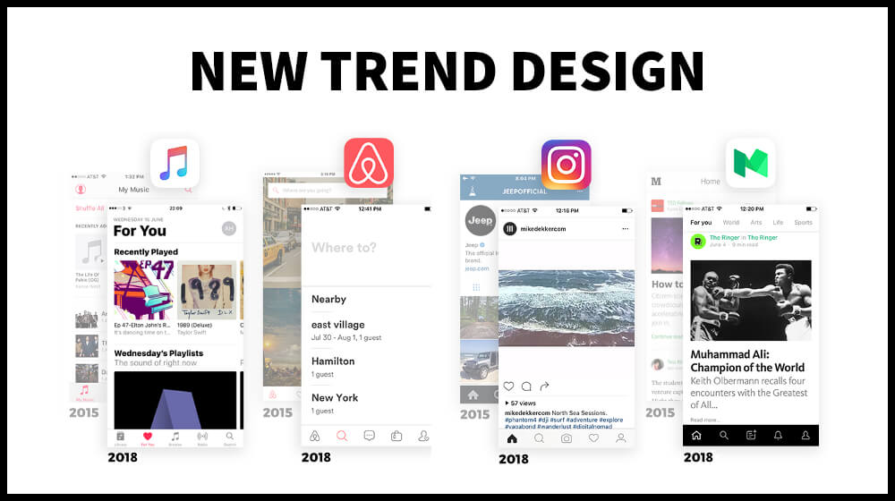
Considering the above characteristics there have been certain changes in the User Interface of the apps the result of which made some of the apps look quite similar to each other. Similarity in the apps depicts that the apps belongs to the same brand. For more clarity on the above argument below given is an example.
Also Read:-Importance of UI and UX in mobile app development
Complexion reduction was tested and tried with Instagram too by bringing certain changes in its user interface. The changes adapted by Instagram were making the base go plain by eliminating more of the blue and grey zone and keeping the base white and sober. Bottom navigation icons previously did not compliment the app much and considering this simplification was made in the bottom navigation icons. Along with it even the headlines turned out to be dark and bolder. Functioning of the app got smooth and content displayed got much clear and visible. The newly designed interface was functioned with ease to use functionalities making it look even more attractive.
These modifications in the apps are now making majority of the apps looking quite similar to each other. But the changes in the UI have proven to be positive in a way. Not talking about the presentation or the look of the applications, but the functionality of the apps has now improved alot. What matters at the end is the functionality and not the look of the applications. The responsibilities of the UX and UI designers have now reduced and they do not have so much of pressure on them now. Their major objecting while designing the app is focusing majorly on the creation and delivery of the best product for the user to use and they now avoid wasting their time much on adding, removing, changing color.
To ensure creating attractive app, do not fail to follow the below given points:
1. Keep it as sober as possible
Keep the base plain with only one colour. Adding too many colours will not bring an attractive output. You can add the colours in the content which will make it look more readable and appealing on the plain base.
2. Work on the Icons
Ensure to keep you icons universal and do not make it colourful at all. Keep it basic. The icons should be simple, easily recognizable, and thin occupying less amount of space. The icons should be arranged from left to right as per their priorities.
3. Increase the brightness of your app icon
The icon of the app should come out to be bright filled in with colours. This will give your brand much visibility and is sure to make you the cynosure of many eyes.
4. Improvisation in the Headlines
The headlines should be comparatively bigger, bolder and also blacker. This will give much visibility to your content.
5. Increase the white spaces
Increase the amount of white spaces on your application. This will maintain the look of the app keeping it attractive to eyes.


