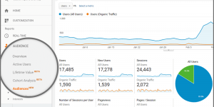
Analytics dashboards are fantastic for telling you what’s happening on your website. Bounce rates, click-throughs, conversions they all paint a clear numerical picture. But numbers alone don’t explain why people behave the way they do. They won’t show you the hesitation before a click, the frustration of a button that looks like text, or the confusion caused by a cluttered form. That’s the blind spot of traditional analytics: they reveal outcomes, not the subtle friction that leads to them.
Where Analytics Falls Short
Standard analytics can show you that a visitor left a page after 20 seconds, but not that they hovered over a confusing element, scrolled back and forth looking for missing information, or tapped repeatedly on something that wasn’t clickable. These small moments of friction often accumulate to create a negative user experience.
Numbers alone can also disguise intent. For instance, a high bounce rate on a service page might suggest disinterest, but what if users are simply leaving because they can’t find the pricing or the next step is buried? Without seeing those micro-interactions, you’re left guessing.
Also Read: How to Improve Website Navigation for a better User Experience?
Spotting Invisible Friction
The moments analytics can’t capture are often the ones that shape a visitor’s perception of your site. Think about:
- A form that asks for unnecessary details and feels intrusive.
- Navigation labels that make sense to you but confuse the visitor.
- Buttons that blend into the background, making calls-to-action easy to miss.
- Mobile layouts that look fine on a wide screen but become overwhelming on a smaller device.
Each of these issues may not directly appear in a report, yet they silently drain conversions. The user leaves, not because they didn’t need your service, but because the experience was too frustrating to continue.
Why Observation Matters
Just as a shop owner watches customers walk through their store to see where they hesitate, linger, or leave, digital businesses need similar visibility. Watching user behavior in context provides nuance that numbers can’t. You begin to notice patterns: where users hesitate, what they try to click, and which paths they repeat. These are the breadcrumbs that reveal where your site creates confusion.
Also Read: Why Businesses Choose Digital Tools Over Manual Fleet Monitoring
Beyond Assumptions
It’s easy to assume you know your website inside out. After all, you helped design it. But that’s the problem, your familiarity blinds you to friction points. What feels intuitive to your team might feel confusing to a first-time visitor. Only by stepping back and watching actual behavior can you uncover the disconnect between intention and reality.
This is where tools like a website heatmap tool become invaluable. Heatmaps show where people click, how far they scroll, and what captures attention. When paired with session replays, you gain context for those interactions. You might see that a key call-to-action is ignored not because it’s irrelevant, but because it’s overshadowed by a more prominent design element nearby.
Balancing Data and Behavior

The most effective approach to uncovering UX friction is a combination of quantitative and qualitative insights. Analytics tells you the “what,” while observation tools reveal the “why.” For example, if analytics show a drop-off on a checkout page, heatmaps and session recordings may reveal that users keep abandoning the form because the “Next” button is below the fold or mislabeled.
When you combine both perspectives, you’re not guessing, you’re diagnosing. You see the numbers, and then you watch the story behind them unfold.
The Human Element in UX

Numbers can’t capture human frustration, confusion, or delight. But those emotions directly impact whether someone stays or leaves. Improving UX means tuning into those emotions and designing with empathy. That might mean simplifying steps, making forms friendlier, or breaking down complex information into digestible pieces.
The goal isn’t to impress users with elaborate design, it’s to help them accomplish their goals with as little friction as possible. The smoother the journey, the more likely they are to stay engaged and trust your service.
Also Read: UI UX Design Trends in 2025: Crafting the Future Art
Turning Insights Into Action
Identifying friction is only half the battle; fixing it is where the impact happens. Start by prioritizing the issues that affect the largest number of users or block critical conversions. Small changes can have outsized effects, moving a button, rephrasing a headline, or reducing form fields can dramatically shift outcomes.
It’s also important to iterate. UX is not a “set and forget” project. Each change should be tested, measured, and refined. Over time, this cycle of observation and adjustment creates a website that feels intuitive and effortless for visitors.
Final Thoughts
Analytics are powerful, but they don’t tell the whole story. Many of the frustrations that push users away live in the spaces between the data, the small hesitations, the missed clicks, the unseen moments of friction. By pairing numbers with behavioral insights from tools like a website heatmap tool, businesses can uncover what analytics alone can’t see.
When you identify and resolve those hidden friction points, your website stops being a digital obstacle course and becomes a seamless experience that guides visitors with ease. And that’s what truly keeps people moving forward on their journey with your brand.


